Design Dilemma: Eclectic Small Space Living with a Euro Twist
In July, we visited the apartment of interior designer Robert Holgate, who impressed us with his eclectic, layered style artfully laid out in 600 square feet. This week, we decided to visit an apartment of a similar square footage, also eclectic, but more “Euro/Scandy” style. That is, it’s eclectic and visually rich, but also pared down, and of course, white.
This week’s small space belongs to Kees de Zwart, 53-year-old financial service employee who lives in a 549-square-foot Amsterdam apartment. de Zwart enlisted interior designer Anja Hesp and contractor René Koomen to create a masculine, but not a heavy, dark space.
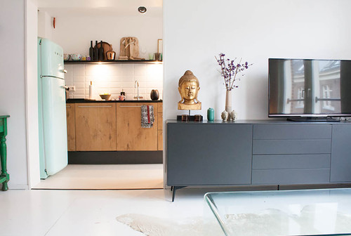
As with Holgate’s space, de Zwart’s apartment liberally mixes an array of styles and periods to create a space that feels intensely personal, even while retaining a spare, minimal look. Above, a 50s style Smeg refrigerator and classic subway tiles in the kitchen work add a little bit of retro punch to contemporary kitchen cabinets. Also in view in the photo above is a sideboard from Bo Concept.
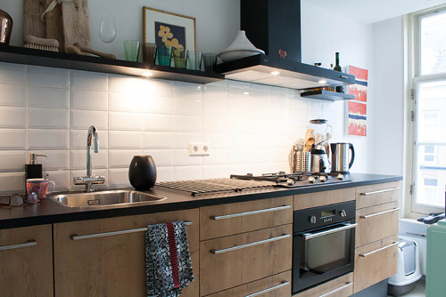
Here are more kitchen views:
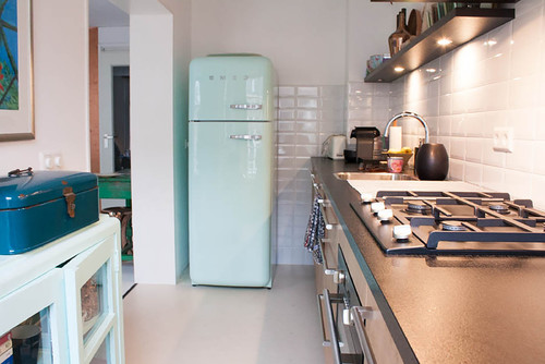
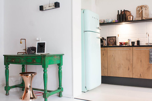
Above, de Zwart painted a vintage cabinet he already owned the same color as the fridge, to continue the vintage vibe. Below, a distressed green desk is paired with a sleek copper stool.
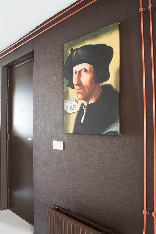
And to introduce a bit of an industrial vibe, in keeping with the desire for a masculine feel, the designer left copper heating pipes uncovered. The copper color has been repeated again in wall color and some furniture selections.
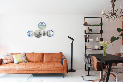
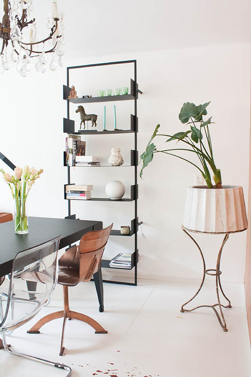
And talk about eclectic! Here vintage plates work with a modern sofa and contemporary lamp. A contemporary bookcase rests below a vintage crystal chandelier.
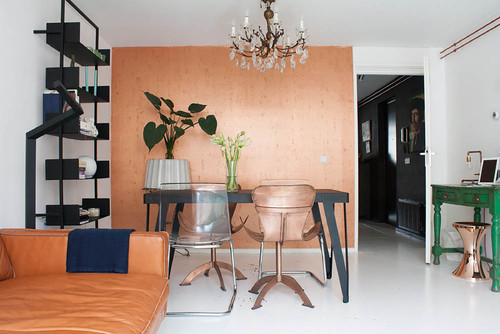
Here’s another view of the living/dining room:
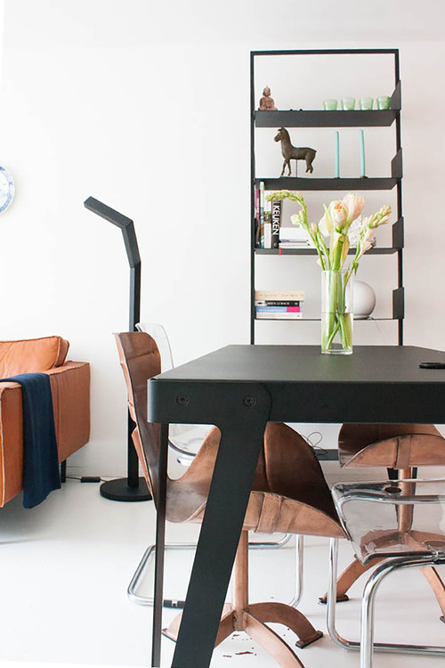
And here, two more views of the dining room:
Why does this space work so well?
- Although the space is small, it has a collected feel because furniture styles are liberally mixed.
- All objects are treated as sculpture, not just furniture. Interesting lines instantly make the apartment visually stimulating, even while objects are kept to a minimum.
- Keeping the floor and walls white keeps the space light and bright, despite a masculine feel.
- The space feels casual yet curated, adding to its appeal.
The look is sparer and more minimal than the small apartment we featured earlier in the summer, but these two apartments actually have a lot in common, thanks to eclectic choices that throw all the standard design rules out.
The Six Courtyard Houses Project in Tucson
An urban infill project by from Ibarra Rosano Design Architects in Tucson respects the private courtyard-based architectural traditions of the region.
At the heart of each of the Six Courtyard Houses is a private courtyard.
The project is sited in a desert town that is plagued by sprawl and lacking in public transportation.
The architects demonstrate the possibilities for higher density, urban infill desert development that is respectful of time and place.
It takes cues from Tucson’s architectural past; plastered masonry walls, central courtyard, and minimal western exposure.
Each of the six looks out onto its own private courtyard.
The courtyard is a traditional concept long employed in hot arid regions.
But the vernacular tradition is updated in this modern interpretation.
A gigantic metal door is hinged from a perimeter wall.
The same internal pivot point is repeated in the entry door.
Bath rooms look onto small private outdoors spaces, giving one the sensation of bathing outdoors
The project is marked by a cool and clean cut aesthetic.
Its tall windows and clerestory windows bring in light in abundance.
While central courtyards, low-rise masonry construction, and thoughtful solar orientation are part of the historical architecture of the region, this project is a new and updated version.
Wood inspires Fujimoto Inquiry Into the Fundamentals of Shelter
Located in Kumamoto, Japan, is a curious structure from Sou Fujimoto Architects.
The unique house is sited in an area of great natural beauty.
The building looks as artless as a child’s play with blocks.
According to the architect, it was conceived by just mindlessly stacking 350mm square.
Across a rope bridge from some equally curious buildings, the structure seems strangely appropriate.
At night, it is lit up from within unevenly like a jack’o’lantern
Its guiding principle was the creation of a harmonious entity before various functions and roles differentiated.
It is of an existence akin to primitive conditions before architecture.
The floor levels are relative and spatiality is perceived differently according to one’s position.
There are no separations of floor, wall, and ceiling.
A place that one thought was a floor becomes a chair, a ceiling, a wall from various positions.
Rather than just a new architecture, says the architect, this is a new origin, a new existence.
