Design Dilemma: Hiding the TV, Part 2
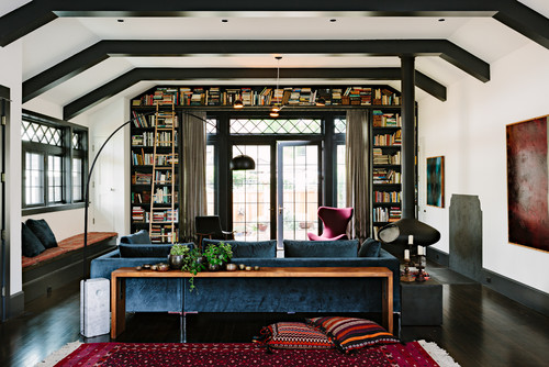
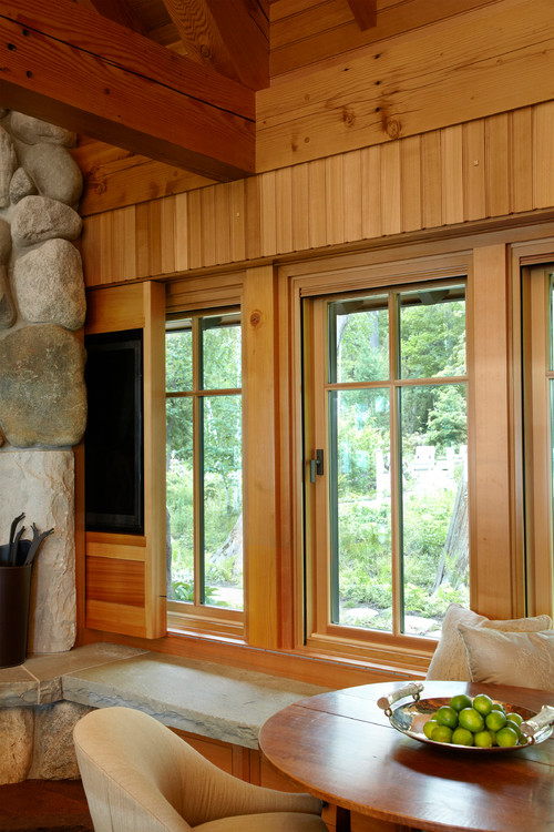
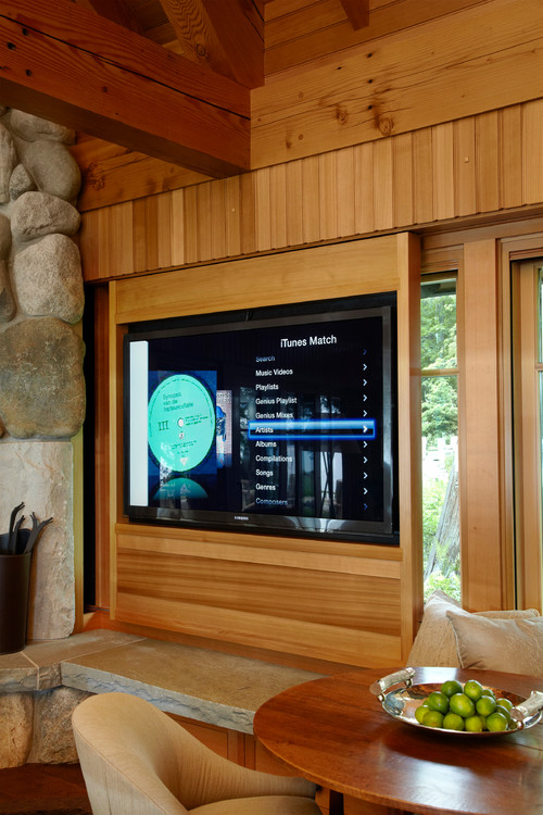
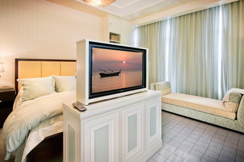
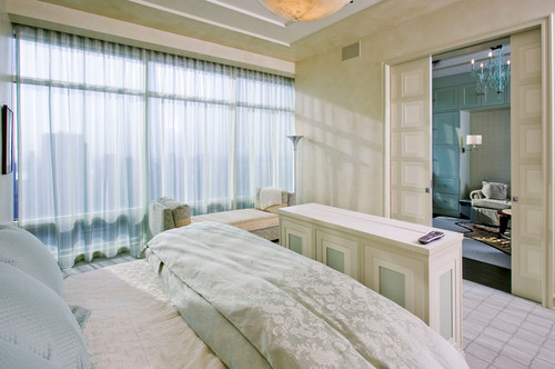
Can you find the TV in the room above? You’ll never guess where to look: The window seat on the left side of the room contains a TV and all of its components. The push of a button brings the TV up on an automated lift.
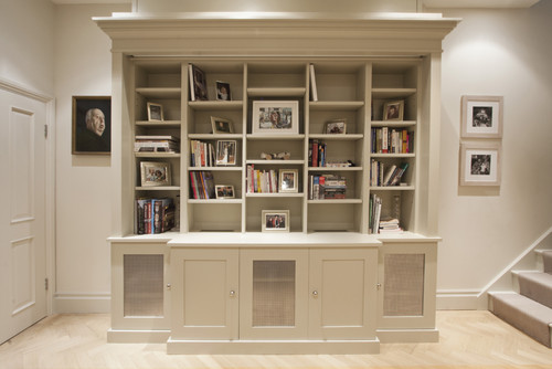
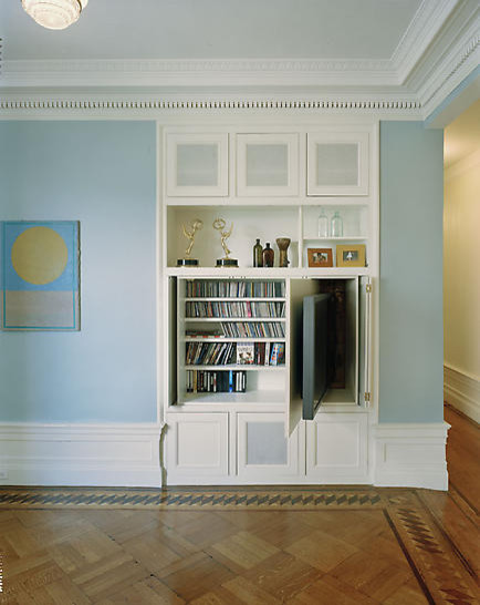
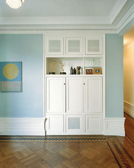
Which leads us to the point of this post: with the advent of flat screen TVs and a new generation of projectors, it’s no longer necessary to keep a TV screen anywhere in sight when not in use. Now, it seems that homeowners are getting increasingly inventive about tucking away TV screens in unexpected places. For instance, below, you have a beautiful bookshelf, right?
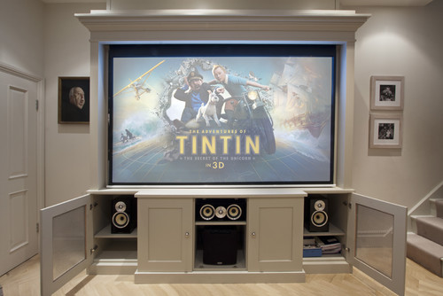
But surprise, surprise, the bookshelf actually incorporates a screen in a compartment above and audio equipment in cabinets below when it’s time to watch a favorite movie:
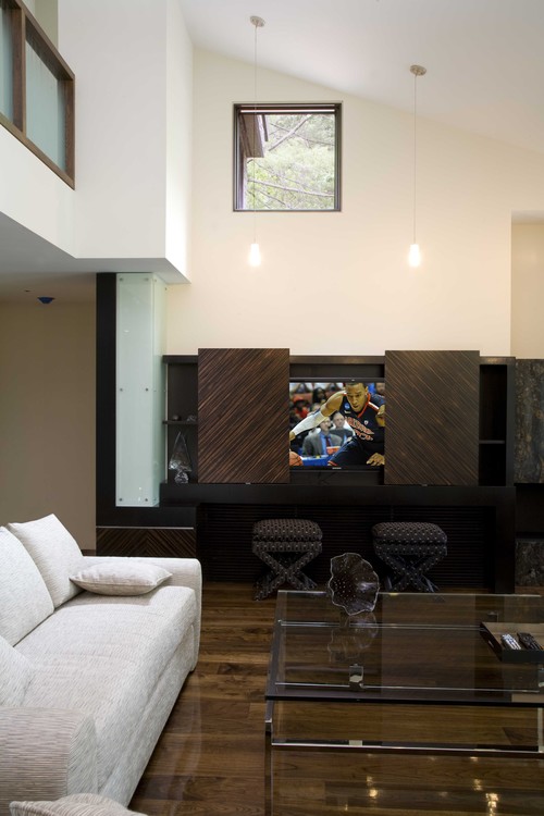
Below, sliding doors keep a TV tucked out of sight.
And here, a sliding compartment allows a TV screen to disappear behind a fieldstone fireplace when not in use:
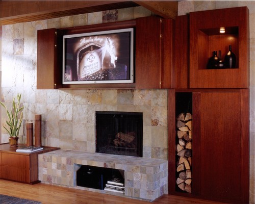
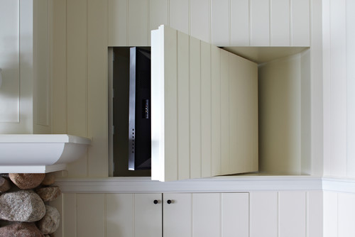
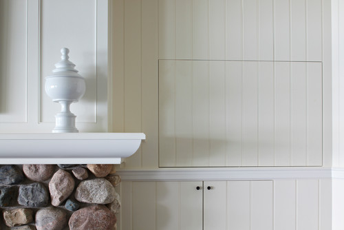
Here’s another TV near a fireplace. Now you see it…
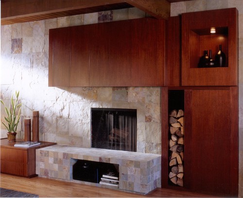
And now you don’t, thanks to folding wooden doors…
In addition to sliding doors and compartments, some homeowners are installing swivel mechanisms that keep TVs tucked away. For instance:
Here’s the same concept:
And then there are those who opt for pop-up TVs.
Now you see it:
And now you don’t:
The important thing to remember if you’re considering a hide-away system is that electronics build up heat and need to breathe. Many of the systems you see incorporate ventilated compartments for any system that is enclosed. The other thing to keep in mind is being realistic about your TV viewing habits. If you love watching TV, it may not make sense to hideaway a TV because doing so often necessitates suboptimal TV placement (often higher or lower than recommended for the best viewing.) If you love your TV, you should best own up to it, and arrange the TV accordingly.
On the other hand, TVs have become massive in recent years, taking up a significant amount of real estate in a room. It seems fair that more of us would want to reclaim our rooms from the big black screen that can suck all the life away. And now, thanks to all the new creative ideas out there, we can much more easily do just that!
Design Dilemma: Less is More and Other Lessons
Before and After make-over photos are fascinating. Not only do they show off the design prowess of proud designers and homeowners, but they always hold lessons for us all when it comes to designing and furnishing our own interiors.
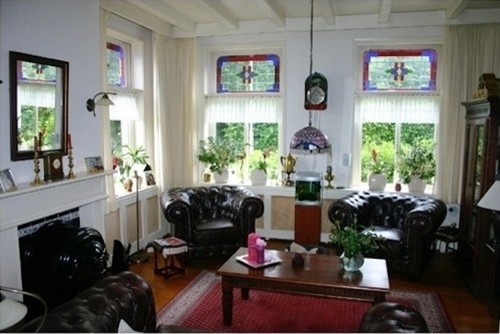
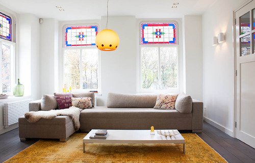
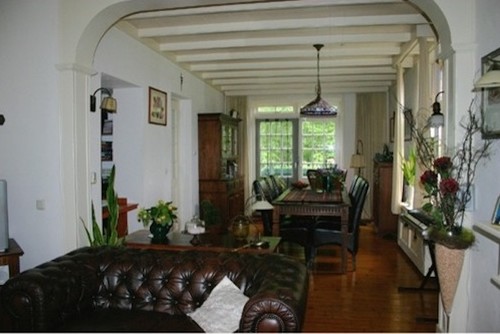
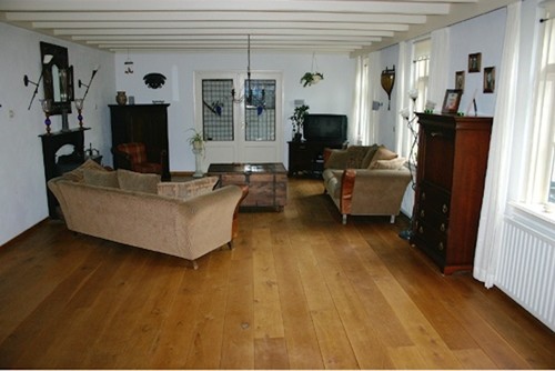
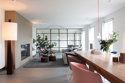
Recently we ran across these before and after photos and were floored by the dramatic differences we saw. Most of all, we felt there were a few basic design lessons that any of us could take away from this makeover, even spending a fraction of the money spent in this particular reno. Just take a look at the above living room transformed below:
What a difference, huh? And here’s more. Here we have a before view into the dining room:
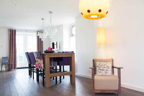
And after:
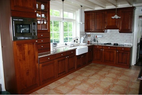
Here’s a before of the kitchen:
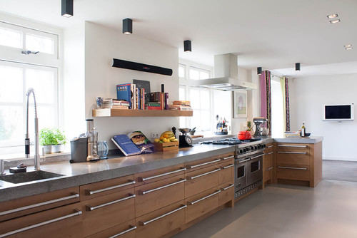
After:
What’s the take-away of these before and after photos?
1) Less is More. Yes, these homeowners have made a whole lot of structural changes that involve paring down. The ceiling beams are gone, along with arches and mantles. But just the furnishing choices alone are enough to make a dramatic difference. In the case of the living room, two bulky chairs and a couch were exchanged for one streamlined sectional, freeing up more floor space, while providing ample seating. The small plants on the window sill are gone, along with the curtains, another bulky china cabinet, radiators, footstools and tchotchkes. In the kitchen, upper cabinets disappear. In their place, appear simple open shelves. The space is one simple, light-filled space with a built-in storage cabinet.
2) Pops of bold color make a difference. The above photos show a space that is mostly brown — brown couches, chairs, tables and furnishings. Without all the dark wood, and with the addition of a sizzling bright orange over dyed oriental, the “after” photos sizzle, without trying too hard. In the dining room, bright purple and patterned chairs add more color and spark, as do the patterned curtains in the dining room. Lighter wood tones feel much more modern than the dark wood in the before.
3) Lighting adds drama. A dramatic pendant lamp in the living room, and equally dramatic wineglass chandeliers in the dining room give these rooms a panache they lack in the before photos. The black down lights in the kitchen make a modern statement without dominating.
Here’s another view of this amazing transformation:
After:
So if you’re hankering to effect a change at home, try getting rid of some furnishing, adding a little color, and adding new lighting.
Dark Concrete House has Bright Contemporary Interior
A bold L shape defines a courtyard-hugging house just outside the town of Santa Maria da Feira in Portugal.
Its rather curt exterior is entirely clad in concrete panels that are tinted a matte black.
By contrast with its dark concrete exterior, the interior has light golden pine and white walls and ceilings.
So the interior spaces are warm and bright.
The dark exterior opaque façade is black prefabricated concrete panels.
But warm wood lines a corridor that soaks up sun and contains the bedroom wing of the L, with the master bedroom suite at its end. Read the rest of this entry »
